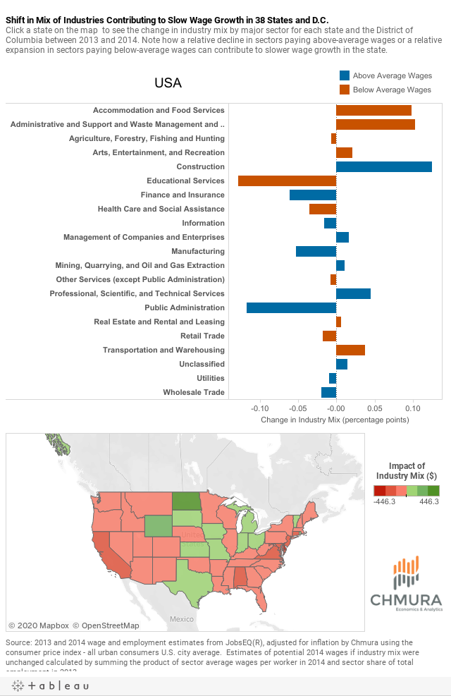
.png)
After adjusting for inflation, annual average wages for workers in the United States grew a meager 0.3% between 2013 and 2014. In contrast, annual average wages grew at an annualized pace of 3.5% between 2001 and 2007 (also inflation adjusted).
Is recent slow wage growth a result of firms being stingy with raises, or is it due to other factors? Chmura’s analysis shows that a shift in industry mix towards lower-paying sectors was a major driver of the relatively slow wage growth.
To examine the recent slow wage growth, we will split that growth into two contributing components:
- Changes in pay within individual industries, and
- Shifts in employment share represented by the percentage of workers in that industry. For example, if employment in an industry expands, but grows more slowly than other industries, its share of regional employment may decline.
Looking at 2014 annual wages in a state as if the 2013 industry mix was constant and comparing that to actual 2014 wages illustrates how much of the actual change in wages was due to the shifting mix of employment by industry. Virginia and North Dakota provide contrasting examples of the changes in industry mix and their effect on wage trends.
In Virginia, major sectors paying below-average wages per worker—such as accommodation and food services, health care and social assistance, and retail trade—gained a greater share of employment. Meanwhile, employment in many sectors that tend to pay above-average wages—especially professional, scientific, and technical services as well as public administration—declined relative to their share of employment in 2013. Overall, the change in industry mix reduced wages by an average $202 per worker in Virginia.
In North Dakota, however, industries like construction; mining, quarrying, and oil and gas extraction; and transportation and warehousing—which pay an above-average wage in the state—gained employment relatively faster than lower-paying industries such as health care and social assistance and accommodation and food services. As a result, the change in industry mix boosted wages by an average $446 per worker in the state.
The map and chart below detail how the shifting industry mix has contributed to the change in average annual wage growth in each state. A negative value (shown in red on the map) indicates that below-average wage industries have gained a larger share of employment in the state in 2014, while a positive value (in green) indicates that higher-wage industries gained relatively more employment.
Data on industry sectors are also included in the chart to illustrate which industries gained or lost employment share in the nation or state of interest over the past year, and which of these pay above-average or below-average wages.